4.2 Label and organize content with your users in mind.
Use words your users know instead of technical or “catchy” terms.24 Remember, your goal is to help users find what they need as quickly as possible.
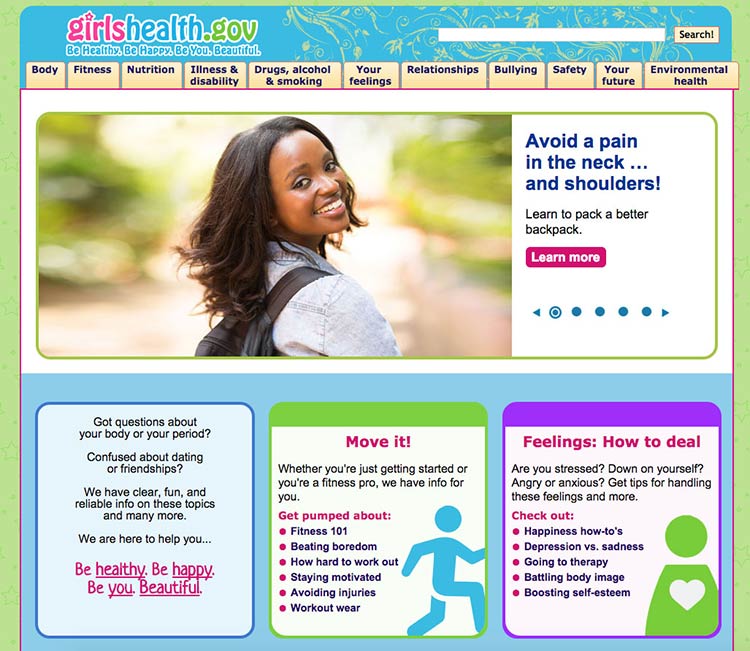
This page from the Office on Women’s Health includes a navigation bar with audience-appropriate category labels (the site is for girls ages 10 to 16). For example, the mental health section is labeled “your feelings,” rather than a technical term.

Source: https://www.girlshealth.gov/
People have different mental models (methods) for grouping health information.36,40 To help different users find what they need, repeat topics under multiple categories. For example, based on card sorting, content on mammograms appears under 3 categories on healthfinder.gov: Cancer, Women, and Doctor Visits.
Next time you need to prioritize, rank, or organize types of content on your site, try card sorting with your users.
Card sorting is a user-centered design technique used to organize content intuitively. Start by creating an index card for each page of your website. Then ask people to sort the cards into groups. This will tell you how users expect to see content organized and labeled on your site.
Alternately, you can have participants rank cards in order of importance or interest. In card sorting exercises conducted by ODPHP, users with limited literacy skills prioritized the following types of health information as most useful:
- Basics I need to know (Understanding)
- I would like to learn more (Assessment)
- I can do this (Overcoming barriers)
- How will this help me? (Motivators)
- Ways I can take action (Strategies)
- Where can I go for help? (Community resources)