4.7 Provide easy access to home and menu pages.
Web users want the option to start over or jump between pages.11 However, we know that users with limited literacy skills typically don’t use breadcrumbs.30,35 In ODPHP usability testing, users with limited literacy skills were also unlikely to click on a logo in the site header to get to the homepage.
With this in mind, include large buttons that take users back to the homepage or the main menu pages on the site.30,35,39
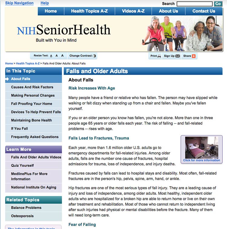
NIH SeniorHealth uses a strong left-hand navigation menu. The current section is highlighted with a different color in the navigation bar so users can easily see where they are in the site.

Source: https://www.nia.nih.gov/health/prevent-falls-and-fractures
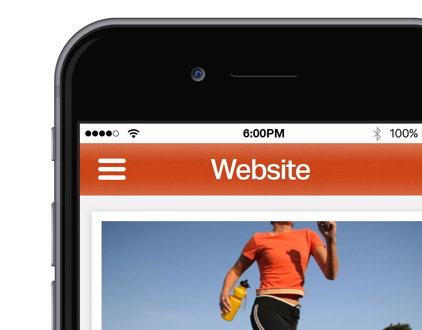
Use a menu button for mobile.
Mobile devices have limited space. Instead of using a left-hand navigation menu on mobile, add a menu button that opens a custom, mobile-optimized menu. That way, users can expand the menu as needed.
Allow mobile users to go back to the homepage by including a home button or a home option in the menu.
Users appreciate when they don't have to retrace their steps but can instead start fresh on the homepage.
Don’t rely on the “hamburger button” as a navigation cue—research suggests that users don’t find it intuitive.81 Instead, try using the word “menu.”

