2. Write Actionable Content
Introduction
Writing for the web is different than writing for print. Most web
users—including those with limited literacy skills—are looking for
specific information or an answer to a question.24 They
typically don’t stay very long on a page. In fact, the average time
spent on a page is usually 15 seconds or
less.24,25,26
When it comes to health information, web users want to quickly and
easily do 2 things:
- Understand the health problem or behavior
- Find out how to take action—in other words, what they can do to change
their behavior or address the
problem27,28,29
Content is the most important element of your
website.24,30 No matter what the literacy
level of your audience is, always aim for health content that is:
- Brief and to the point
- Actionable and engaging
When you write actionable content, it means that you’re focusing on
health behavior: tell users what you want them to do and give them steps
to do it.
Engaging users means presenting content in a way that motivates them to
take action. Examples of engaging content include:
- Interactive tools
- Checklists
- Conversation tools
High levels of engagement with online health information can lead to
health behavior change.31
Remember, plain language alone is not enough. If you want users to
adopt healthy behaviors, you also need to write actionable health
content.
2.1 Identify user motivations and goals. Why are they here?
Motivation drives the search for health information and influences
users’ performance on a website.32,33
Understanding users’ motivations will help you write actionable,
targeted health content to meet your audience’s information needs and
expectations.
Users want the answer to a question.
Keep in mind that most web users have a specific goal in mind. Usually,
they’re trying to answer a
question.7,8, 24 Conduct
research with your users to find out what that question is—ask them what
they want to know. Then decide on the best way to give them that
information.
You can get basic information about your users online.
The best way to understand users’ motivations is to talk to them, but
you may be able to find some of the basics about an audience—like
demographic information—online. (Learn more about how to conduct
research with users with limited literacy skills in section 6.)
For example, ODPHP’s research identified several common motivations for
users who seek online health information. From this research, we know
that many users go to the web to:
- Learn about a health problem affecting them or someone they know
- Find out whether they have a health problem or reason to be concerned
- Learn how to prevent health problems32,33
Expect users’ motivations to change.
Studies have also found that what’s driving your users tends to
shift—often frequently.24 With that in mind, make sure your content meets
the different goals users may have for seeking health information.
The formula below was developed based on the motivations of users with
limited literacy skills. It’s designed to move users from “I want some
information about a topic” to “I want to do something about it.”
Follow this proven formula for presenting health promotion information:
- Describe the health behavior
- Describe the benefits of taking action
- Provide specific action steps
 Quote
Quote
“Get my attention. Then get to the point.”
2.2 Put the most important information first.30
Many users with limited literacy skills read only the first few words on
a page or paragraph. If they think the content will be easy to get
through, they may keep reading. If they’re overwhelmed and think it
might be too difficult, they’ll skip to a different spot on the
page.7,27,28,34,35,36,37
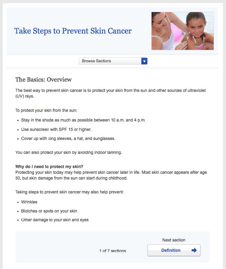
Figure 2.1
This healthfinder.gov topic puts the most important information about preventing skin cancer first. Additional information comes after the basics.

By putting the most important information first, you’re also structuring
your content for mobile users—and for busy users no matter their
literacy level or the device they’re using. Eye-tracking data shows us
that all users tend to read content at the top of a webpage and lose
interest quickly if the information doesn’t seem relevant to them.25
2.3 Describe the health behavior—just the basics.
Start by introducing the behavioral objective. Users want actionable and
specific behavioral
guidance.28,38,39,40 In
other words, tell users both what to do and how to do it. Focus on
behavior rather than background information and statistics. Remember,
it’s important not to overwhelm your users.
Think “need to know” vs. “nice to know.”
Health information doesn’t need to be comprehensive. Instead, usability
research has shown that many users prefer to learn “just the basics”
about a health topic.30 What do your users need to know to take
action? Keep your information direct and to the point. People who are
motivated to find more information will dig further.26
 Quote
Quote
“Just tell me what I need to know.”
Example
- Before:
- Blood pressure is the force of blood against the walls of
your arteries. Blood pressure should be checked often.
- After:
- Check your blood pressure every 2 years, especially if you
are age 40 or older.
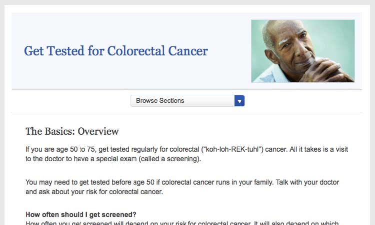
Figure 2.2
The first sentence on this page from healthfinder.gov
includes the behavioral recommendation (regular screenings for people
ages 50 to 75).

 Quote
Quote
“I like this website because it gives you the
information you want right away. It gives you the basics, not too much
to read.”
2.4 Stay positive. Include the benefits of taking action.
Users overwhelmingly prefer a positive tone, so make your case without
being too negative. During card-sorting exercises, users prioritized
information on motivators and overcoming barriers to behavior change —
not information about the risks and barriers
themselves.8,27,29,39,41,42,43,44
Give users motivation to make a change.
Users want to know what they can gain from changing their behavior.
Example
Physical activity can improve your heart health—not to mention help you
feel better in your daily life!
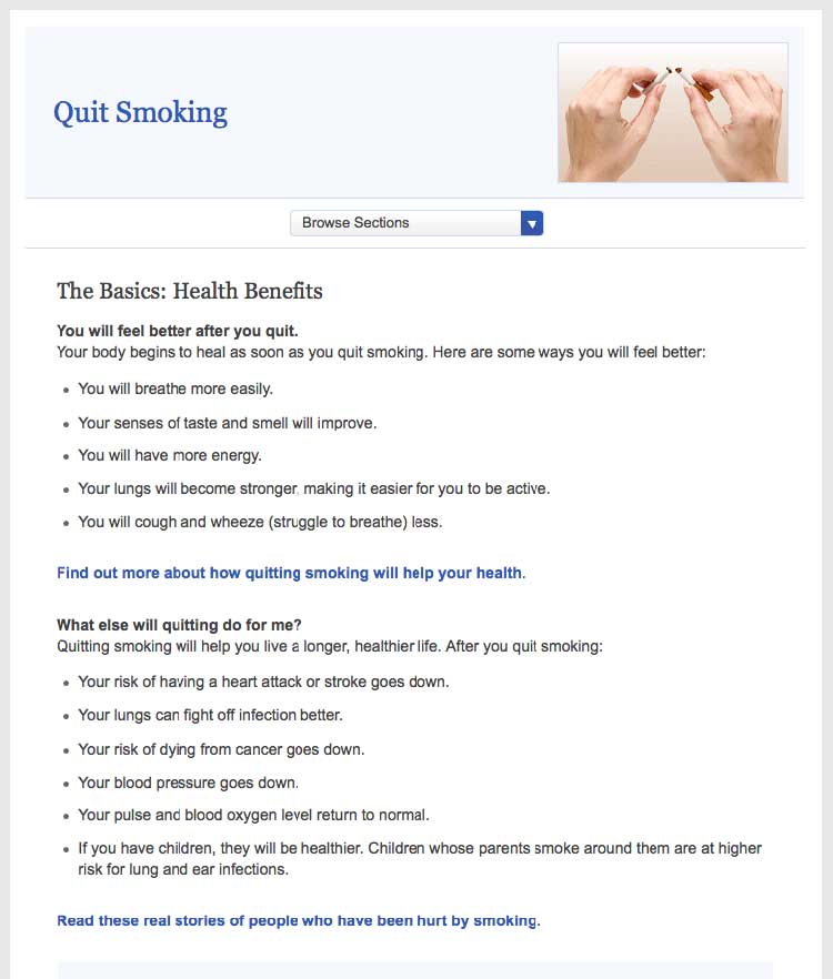
Figure 2.3
This healthfinder.gov page clearly lists the benefits of
quitting smoking instead of focusing on the risks of continuing to
smoke.

Be positive.
Instead of telling people what not to do, give users positive reasons
to change their behavior.
Example
- Before:
- Never ride a bike without a helmet.
- After:
- Wear a helmet every time you ride a bike.
Try this
When choosing language, limit the use of “don’t.” This
automatically sets up negative framing. Additionally, try not to use
“should”—it can sound “preachy” or condescending.
Focus on tips and tools for overcoming barriers—not on the barriers
themselves.
Users need to overcome many perceived and actual barriers on the road to
health behavior change. Be realistic—it’s important to acknowledge these
barriers and continue to offer encouragement and
motivation.45
Example
Quitting smoking is hard, but millions of people have done it
successfully. In fact, more than half of Americans who have ever smoked
have quit. You could be one of them!
2.5 Provide specific action steps.
Give users the tools they need to get started. Users are looking for
action steps, especially things they can do immediately.28,38,39,40,41
It’s not enough to tell users what to do. You also need to tell them
how to do it.
Break behavior into small steps.
Breaking behaviors into small, manageable steps gives users choices
about which steps feel realistic and doable. When possible, lead with
steps users can take right away.
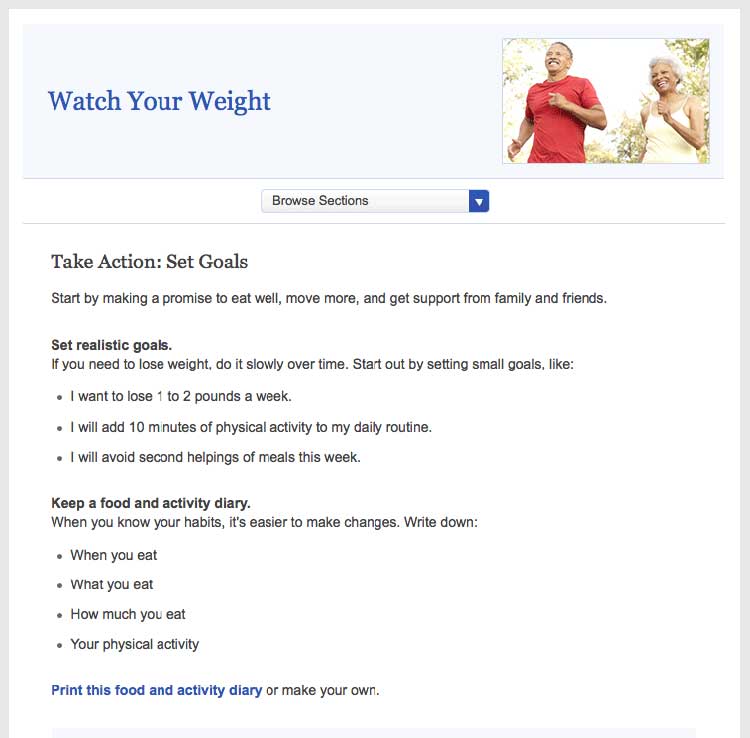
Figure 2.4
This healthfinder.gov page has specific action steps—they’re
concrete and manageable.

Breaking behaviors into small steps improves users’
self-efficacy.28,38,39,40,41
Try this
Next time you’re creating messages, incorporate personal
stories of people who have made a healthy behavior change to strengthen
your messaging. Storytelling can go a lot further than statistics when
it comes to improving your reader’s self-efficacy. Even adding a single
quotation from someone your reader can relate to can make a big
difference.
Create interactive content.
As part of your action steps, engage users with interactive content like
menu planners, printable checklists, and questions to ask a doctor
(learn more in section 5).
 Quote
Quote
“This is good information because a lot of
times, I take information to the doctor and ask questions about diet
issues, what to avoid, and medications.”
Explain the “why” of the action step.
Tell users the reason behind what you’re asking them to do. This will
help them understand why it’s important that they take the step.
Example
Keep a food diary. Knowing what you eat now will help you figure out
what you want to change.
2.6 Write in plain language.
Developing website content in plain language means that your users will
be able to understand what you’re trying to say the first time they read
it.47
Keep paragraphs and sentences short and simple.47
Try to keep sentences to 20 words and under.30 Try to keep paragraphs
to 3 lines or less.7,24,48
Always use language that is familiar to your
users.7,8,24,27,30,35,49
Avoid jargon terms when you can. Choose language that your users can
relate to.
Use the active voice.
Write in the active voice.47 Writing in the active voice means that
the subject of your sentence performs the action. Active sentences:
- Are more actionable and direct
- Are easier to understand
- Generally require fewer words24,30,37,50
Example
- Passive:
- Tests may be needed to find out what’s wrong.
- Active:
- You may need a test to find out what’s wrong.
Define complex terms.
When introducing a medical term, clearly define the term the first time
you use it. Define the word in context rather than using a glossary or
scroll-over definition.
Example
Your primary doctor may refer you to a neurologist. A neurologist is a
doctor who treats problems related to the brain and nervous system.
Think about whether it benefits the user to learn a jargon term—or if it
makes sense to work around it. For example, a person with epilepsy needs
to know the term “neurologist,” while in a different context it may be
enough to say “specialist.”
If the most accurate word is an unfamiliar medical term, incorporate a
plain language definition into the text the first time you use
it.51 Consider making the definition part of the
sentence or placing it between em dashes.8
Example
The medicine can cause vomiting—throwing up—if you take it on an empty
stomach.
Use everyday examples to explain medical or technical concepts.47
Always choose words and images that your users can relate to.
Example
When you get a mammogram, the nurse will place your breasts between 2
plastic plates and take a picture of each breast.
Write in a friendly, conversational tone.
Formal language can make health content feel less accessible to your
user,37 so write how you speak. Use contractions.52
Use second-person pronouns when you can to speak directly to your
reader.47
 Quote
Quote
“I like [this website] because it’s easy for
everyday people like me to read. No big words or medical terms.”
2.7 Check content for accuracy.
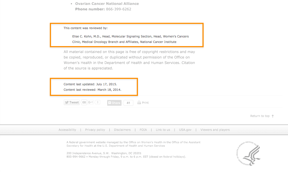
Have a subject matter expert or panel periodically review your health
content for accuracy. Post the date the content was last reviewed and
the reviewer’s name and contact information. This gives your content
more credibility with users.
Figure 2.5
The date the content was last reviewed and the name and contact
information of the reviewer are both clearly displayed at the bottom of
this page from the Office on Women’s Health.

Develop a style guide.
Use a style guide to keep your content consistent. Style guides are
especially helpful when writing about something like health—a subject
that includes many topic-specific words and phrases. A content style
guide will help you establish a streamlined set of health-related terms
that users will come to recognize in your content.
A style guide also lays out the rules for writing content for a specific
website. A style guide can help you keep track of grammar, spelling, and
writing preferences. (For example, is it “website” or “Web site”?) You
also can use a style guide to keep track of heading and font size.
A style guide is an evolving document. Writers and editors will likely
add to it over time. Be sure to keep it easily accessible.24 Many
organizations use a wiki for their online style guide because it’s easy
to update and share. (A wiki is a website that allows for the easy
creation and editing of web documents.)
For tips on creating a content style guide, check out this resource
from
digitalgov.gov.
Summary
On the web, and especially on mobile devices, users want to find the
information they need as quickly as possible. Regardless of your
audience’s literacy level, keep your content short and to the point, and
write in plain language.
But plain language isn’t enough—if you want your users to change their
behavior, write health content that’s actionable and engaging. When you
give your users clear action steps—and motivate them with engaging
content like interactive tools and checklists—they’re more likely to
follow through.
In the next section, we discuss best practices for design and layout to
make your content easier to read and give it an approachable, inviting
look.

